A.L.Ex Logos & Wordmarks
2016–2017
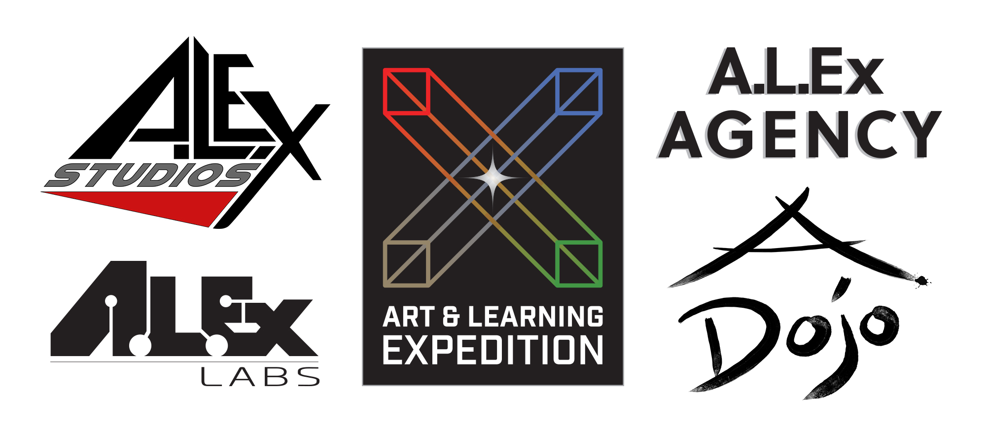
A.L.Ex, LLC was a chimera of a company. We had four arms of the business under the umbrella "Art & Learning Expedition", which was actually a backronym for "A.L.Ex".
As the internal graphic designer, it meant I got to make five different logos for one company. The "X" was meant to symbolize the four arms. Each arm converged and interwined at the center, which was in turn bejewelled with a starburst, symbolizing the "singularity" or something. I like to think of it as a creative spark.
To this day, it bothers me that A.L.Ex does not include the third period after "Ex", making it an inproper abbreviation.